

WeeCare Early Learners Redesign
OVERVIEW
WeeCare is a daycare platform matching parents to the right provider and supporting providers with tools to grow and manage their business. The Early learner program supports daycare providers with ready to use the curriculum created by early childcare experts.
The goal of this project: identify the causes for low engagement and redesign the feature based on findings and business goals
ROLE
Lead Designer, Team: 2 designers, 1 Product Manager, 3 engineers
PLATFORMS
Android, iOS
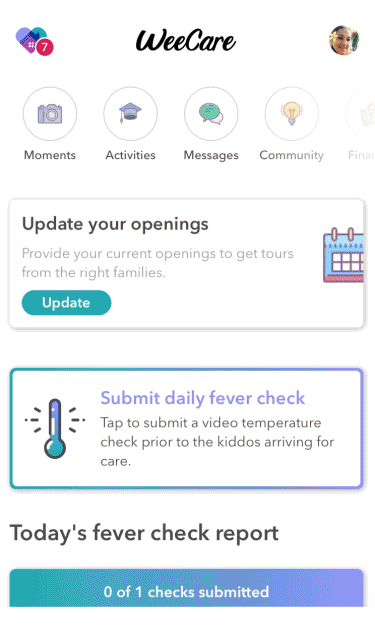
User Research
Despite receiving positive feedback about the rich content of the activities themselves, the feature was underutilized by providers. The team conducted provider interviews to uncover pain points about the current experience.

"I feel like the activities themselves are great but the structure is too rigid. There's no way to change activities or switch themes on a day to day basis and you need to be flexible with the kiddos. In the end, I don't end up using it as much because I make up my own schedule."

"Right now the instructions are really overwhelming to look at and I don't have a lot of time to sort out what's what, especially during the day with the kids."

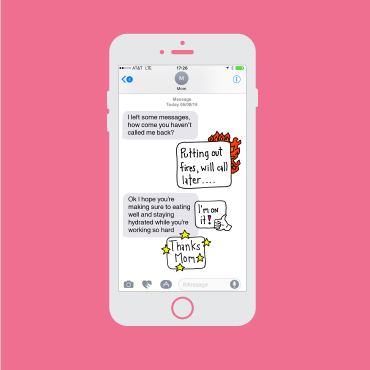
"I like to keep parents informed but in the moment it's hard and the photos pile up on my phone so I send pictures without explanations. Parents are always asking to know more and I want to show the parents what I'm doing is not just glorified babysitting."
Insights and takeaways
INFORMATION OVERLOAD
The display of content focused too much on lengthy activity descriptions and instructions. Images were not seen until drilling down several levels in the activity detail page. With very little time the wordiness and lack of images were barriers for providers to easily understand how to implement the activity.
RIGID UX
The first version was based on the assumption that users would follow an explicit activity schedule and wanted a specific schedule. We learned providers require more flexibility and want to make adjustments and changes to their daily activities as needed.
RIGID CODE
Systematically we realized the architecture built on weekly themes instead of individual activities prevented any customizable functionality. In order to accomaodate a more flexible experience the backend would need to be rebuilt as well.
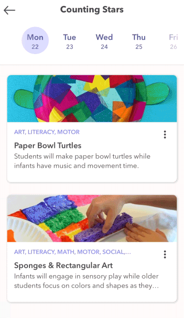
The Solution
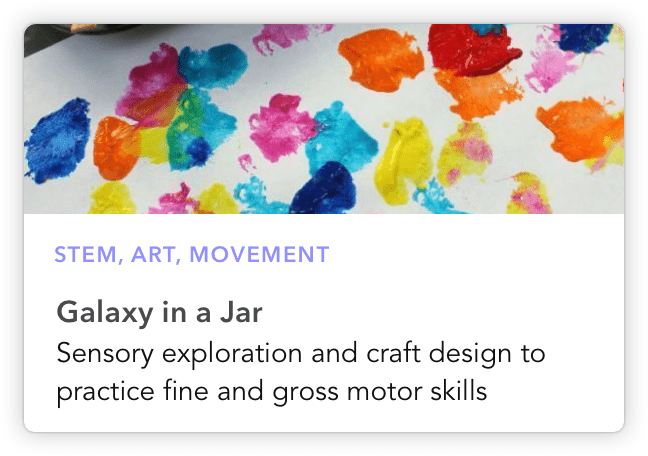
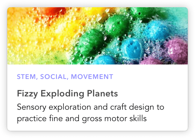
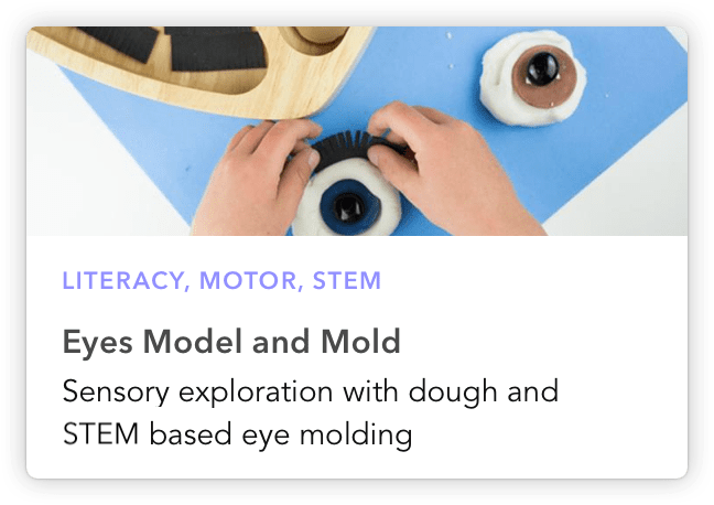
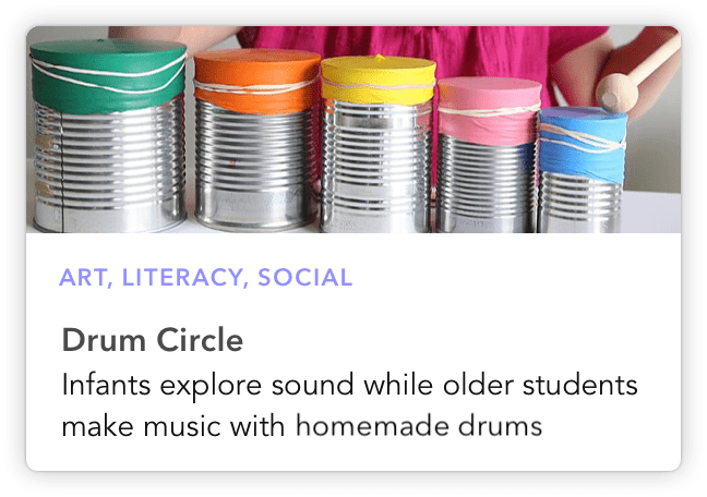
A system built on single-unit activities allowing providers the ability to search, swap, and customize unique schedules based on their needs. The visual card-based approach and improved activity detail UX supports better usability for providers teaching on the go.
Custom scheduling
A more flexible system allows providers the freedom to choose from thousands of activity plans created by early education experts. Providers can:
*Search by learning centers, topics, & supplies
*Add and remove activities
*Manage their weekly themes
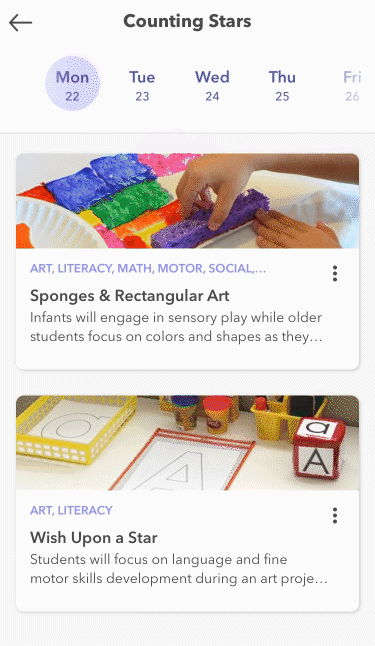
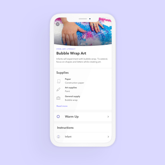
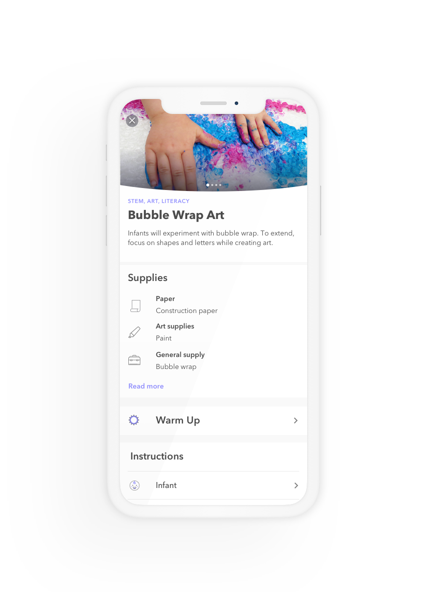
Improved activity detail page
The improved activity detail page focused on a scannable top level of information and easy drill-downs into each section. Specific improvements included:
* Swipable images carousel on top-level
* Clear delineation of age-appropriate instructions
* Consolidated supply list
* Bite-size instruction copy
Parent updates & participation
Providers can share what children are learning through the WeeCare app and parents can track their progress, to ensure continuity of education at home
*Providers can send real-time photos with a detailed description of each activity
*Instructions for parents to continue education at home and reinforce lessons learned during the day