Honey First-time User Redesign

OVERVIEW
The Honey shopping extension saves users money by automatically searching for coupons and adding savings to their cart. Honey is free to use however we found a high percentage of users uninstalling the extension after downloading.
The goal of this project: identify the cause of churn and create a new first-time user experience.
ROLE
Lead Designer, Team: 2 designers, 1 product manager.
PLATFORMS
Web desktop
User Research
Using qualitative research methods, I observed first-time Honey users go through our install and onboarding process.
Pain-points Summary
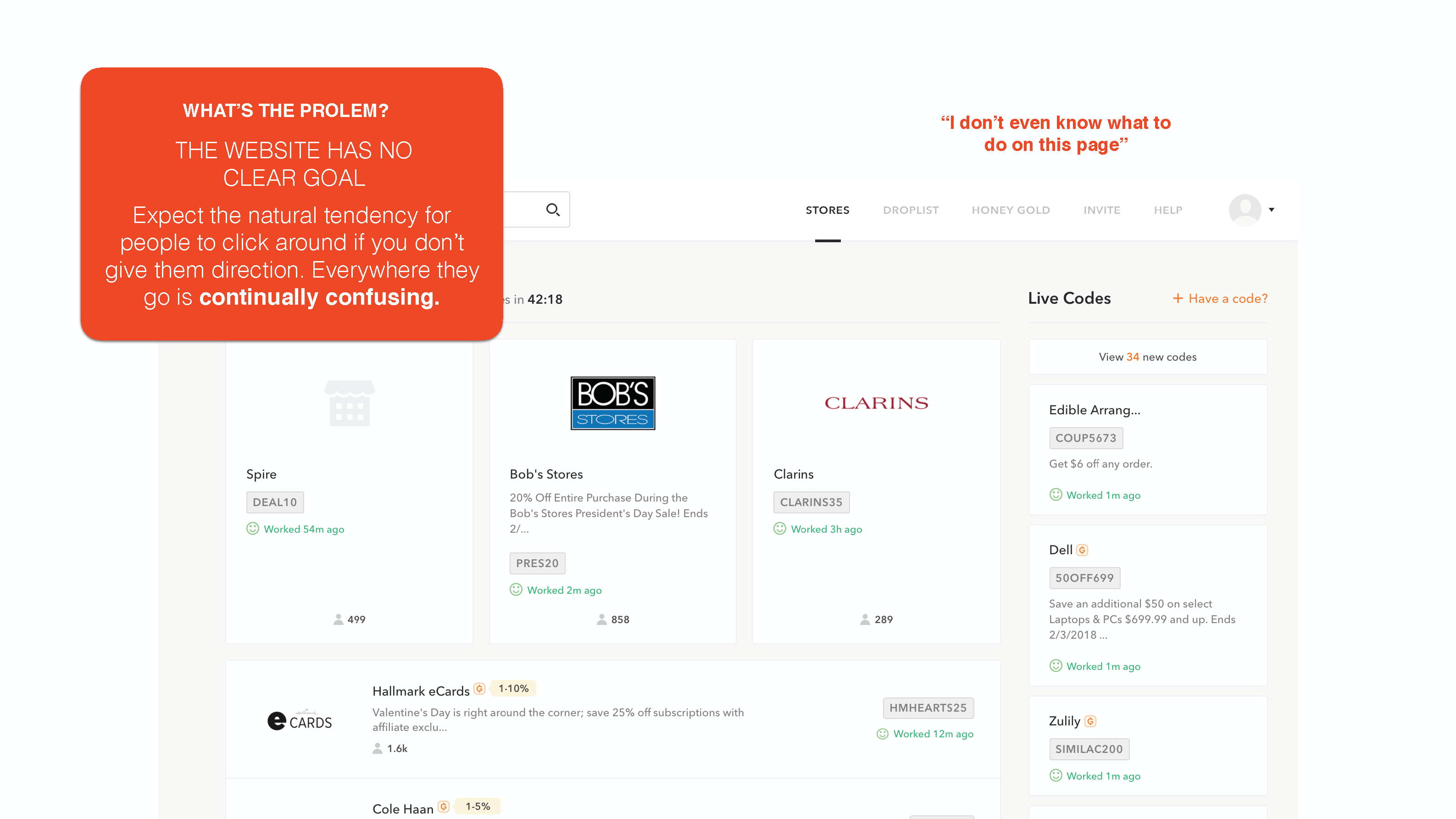
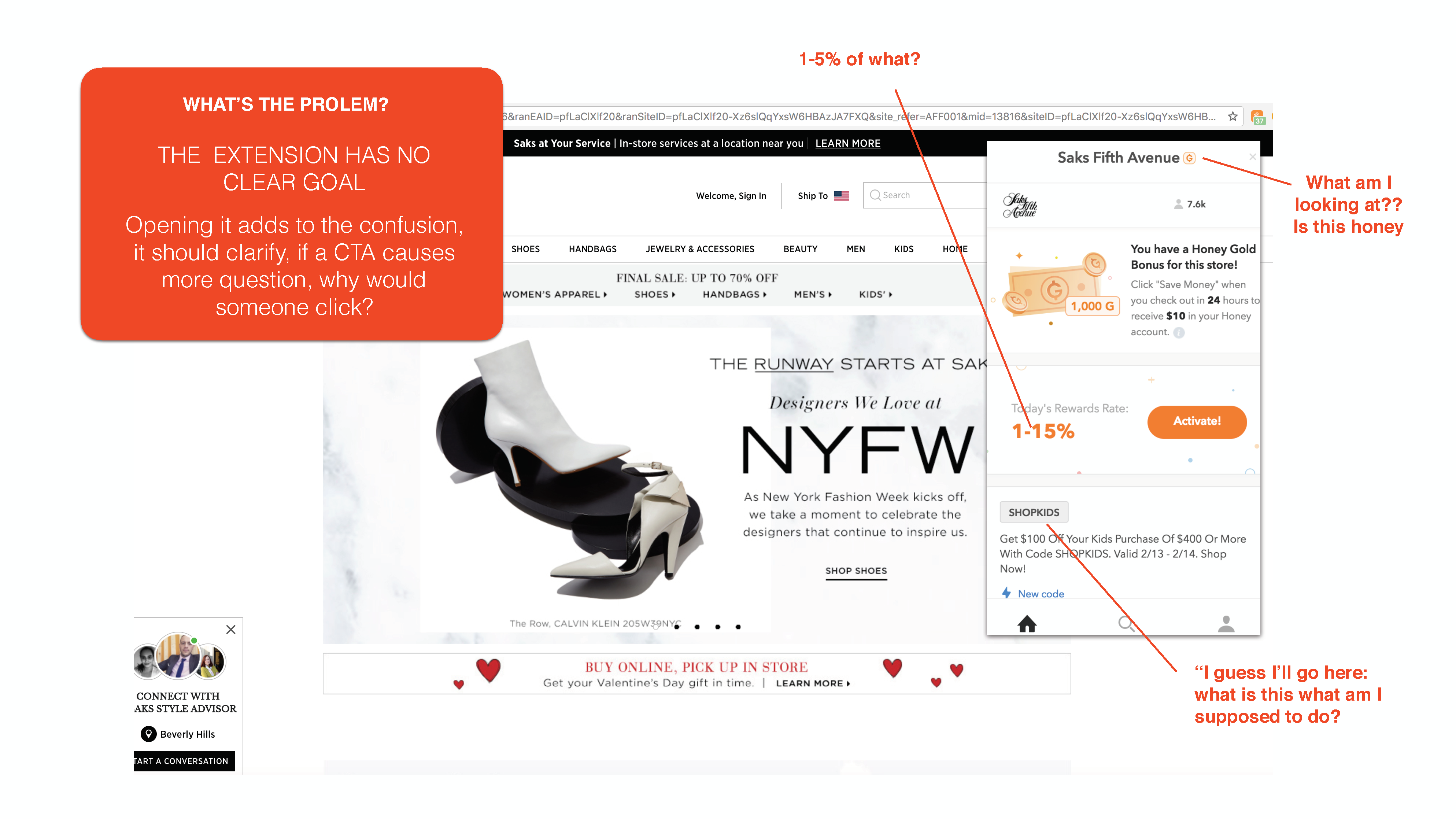
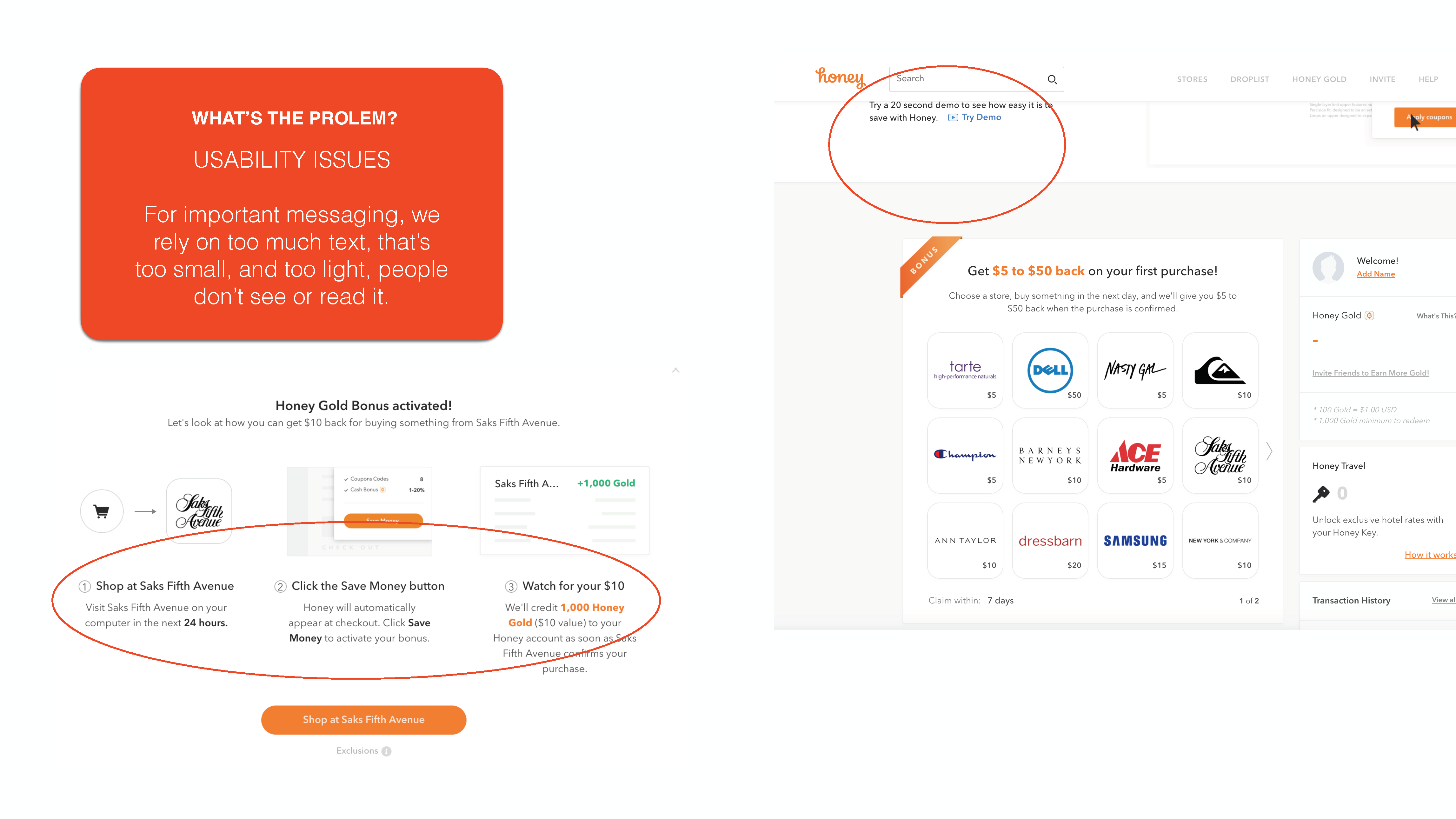
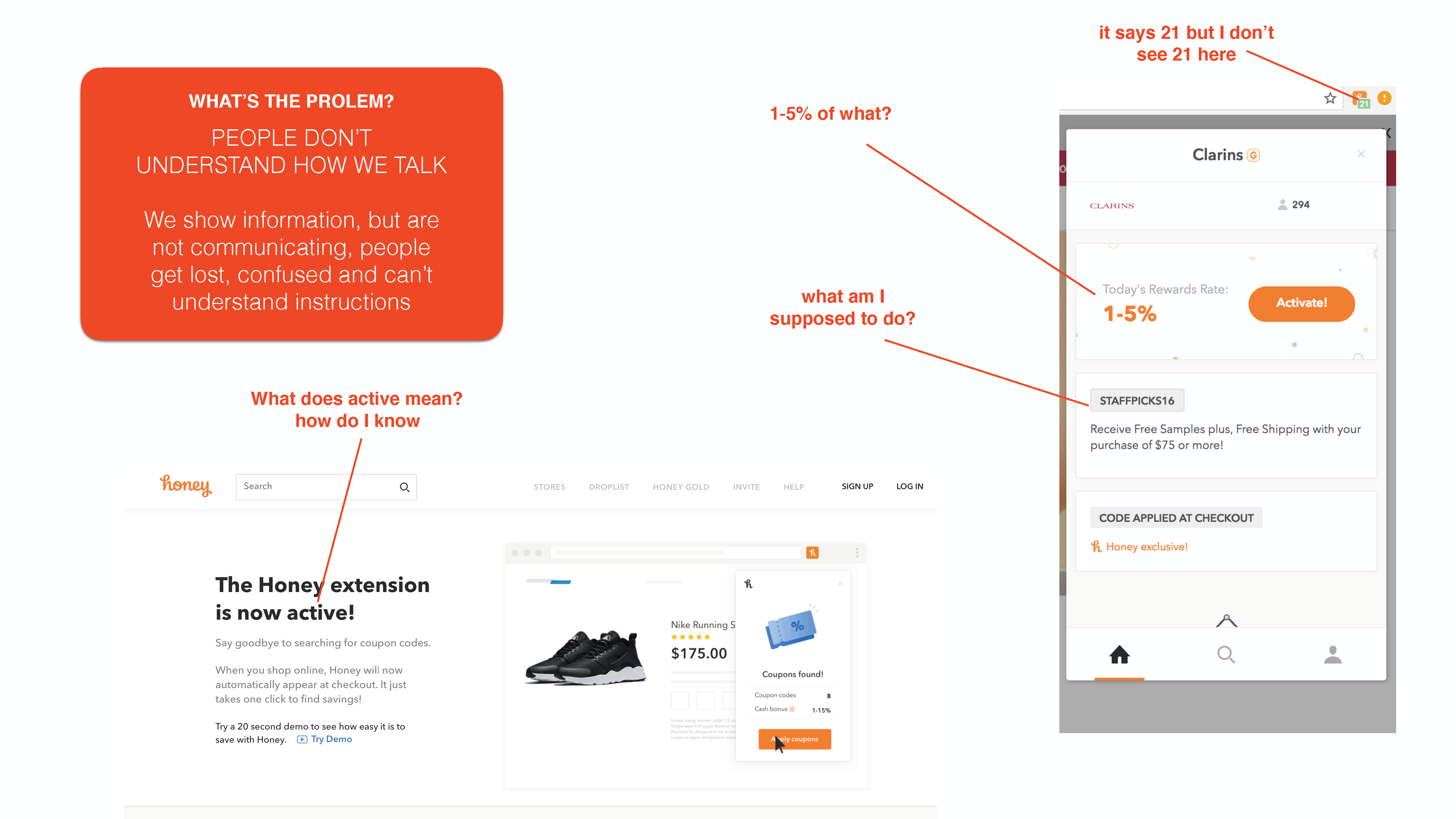
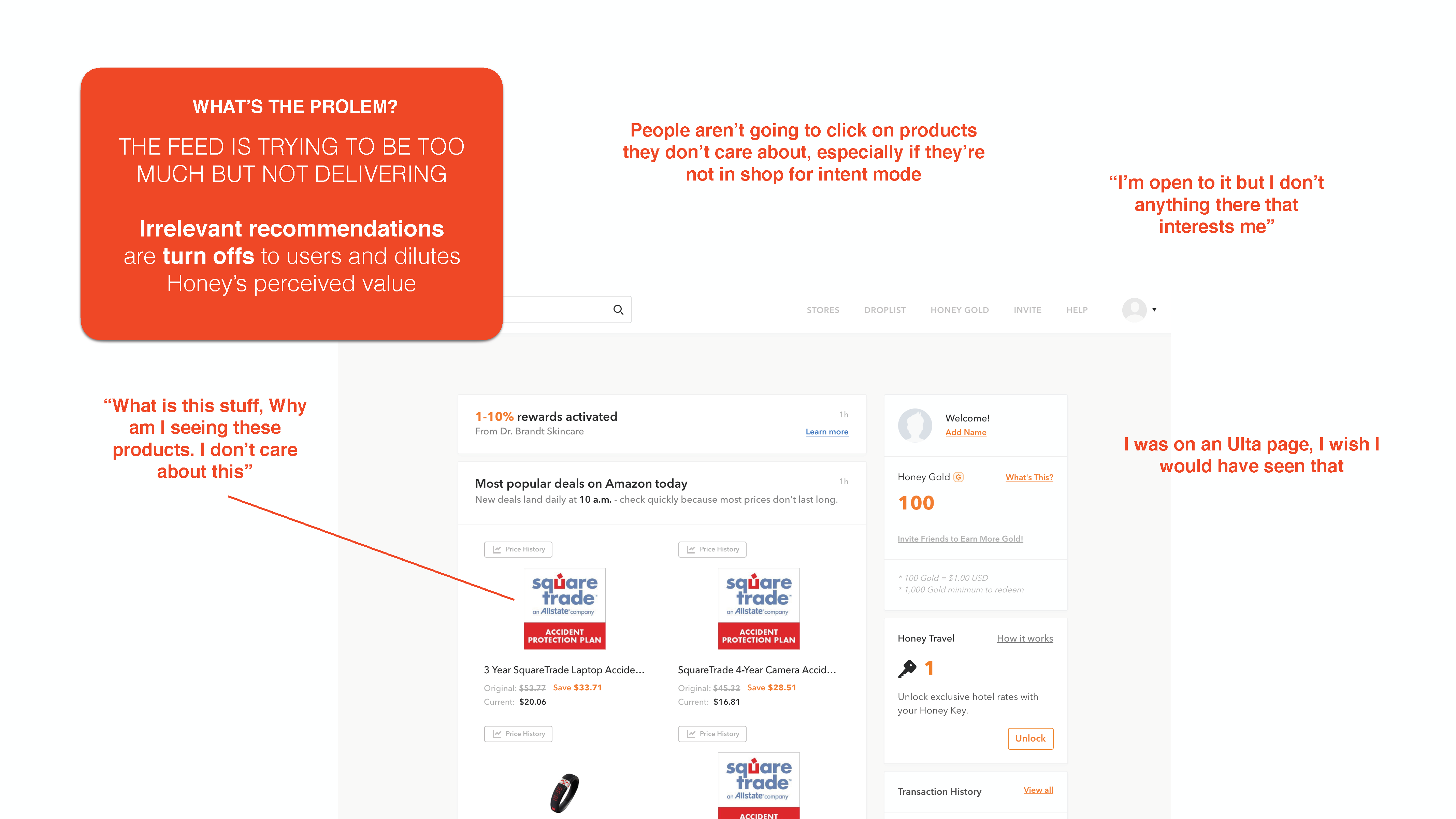
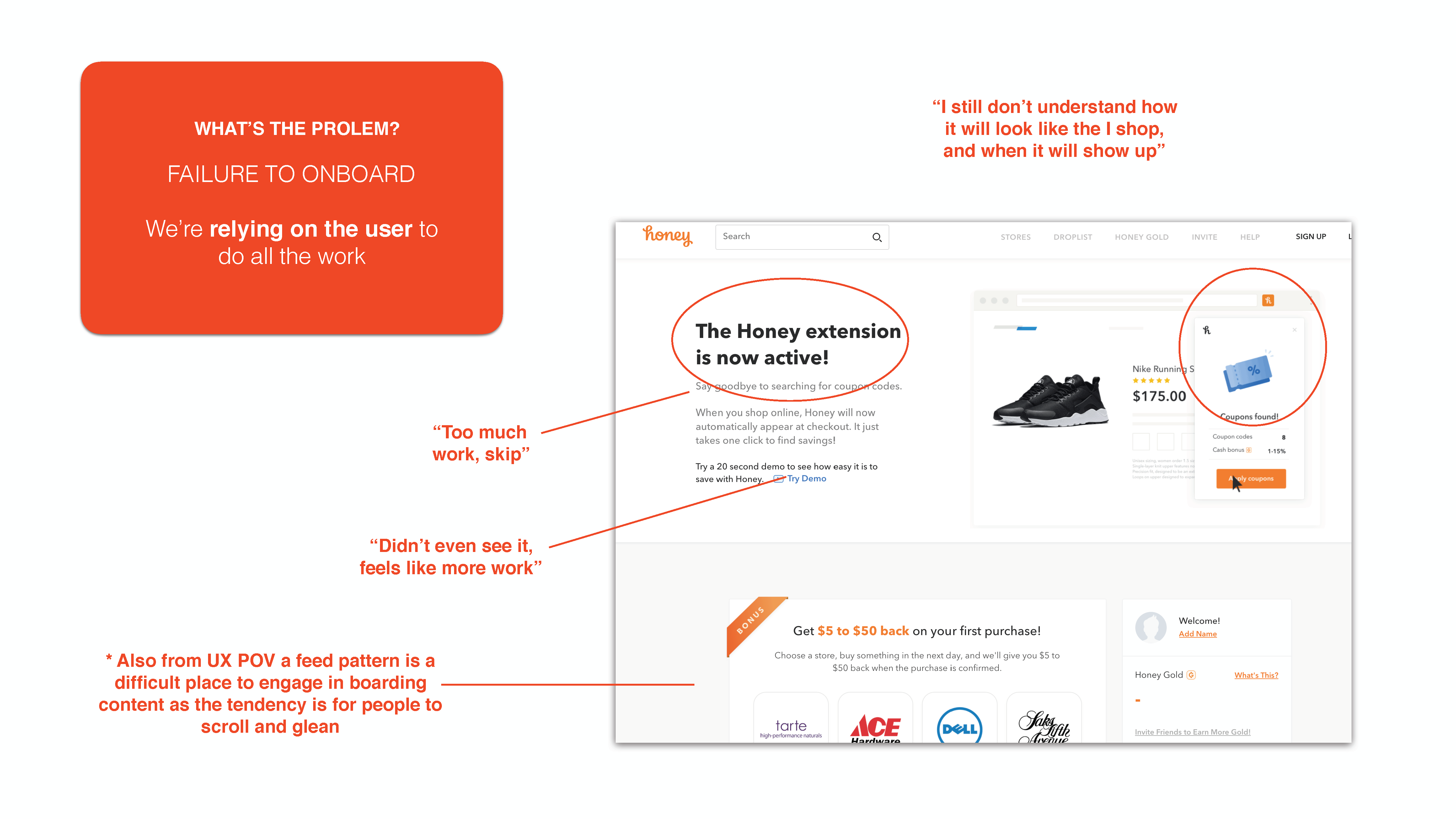
When using Honey for the first time, a pattern of confusion and unanswered question emerged. Ultimately people uninstalled because they didn't understand the product after being sold on its ease of use and effectiveness.


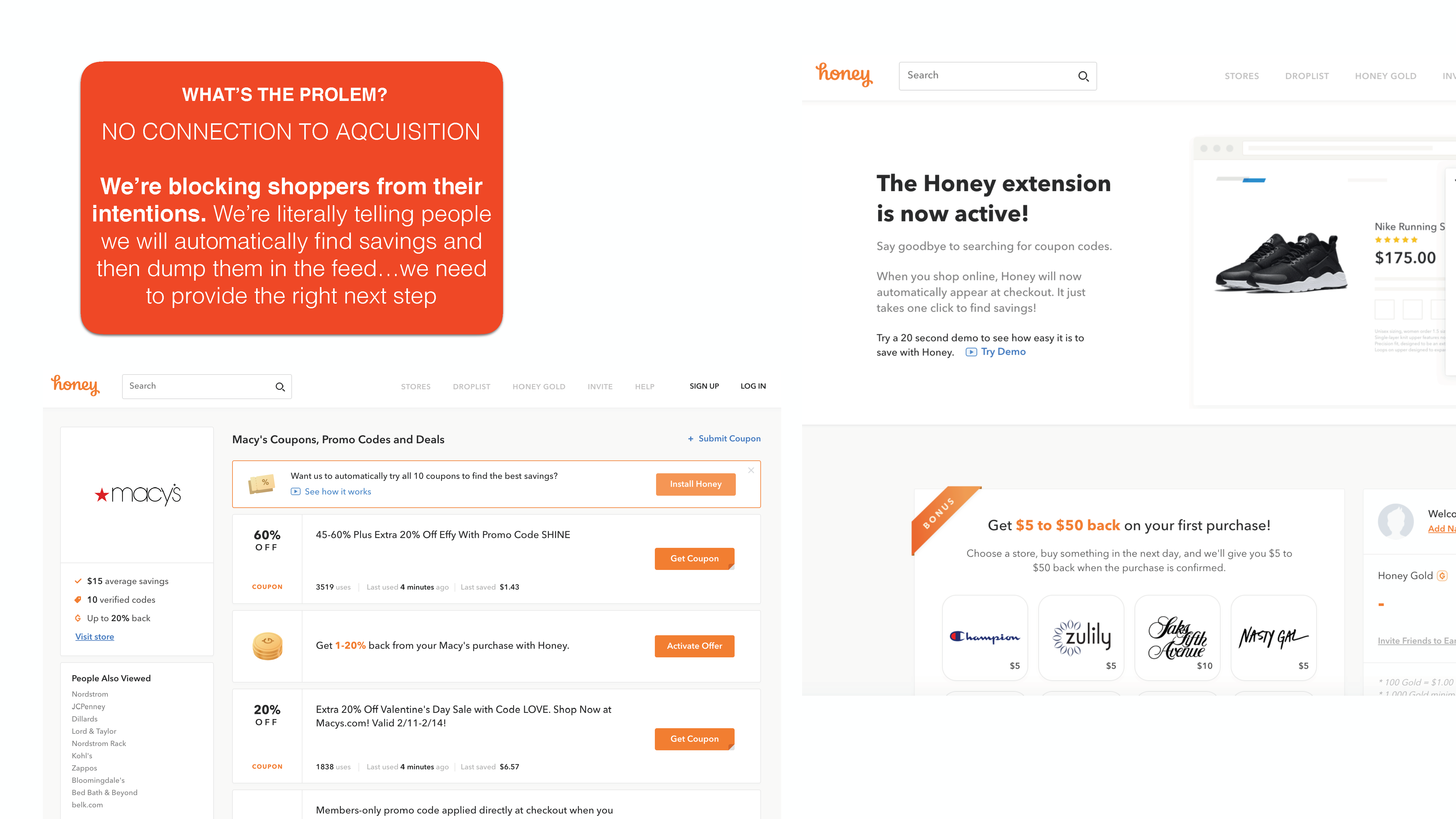
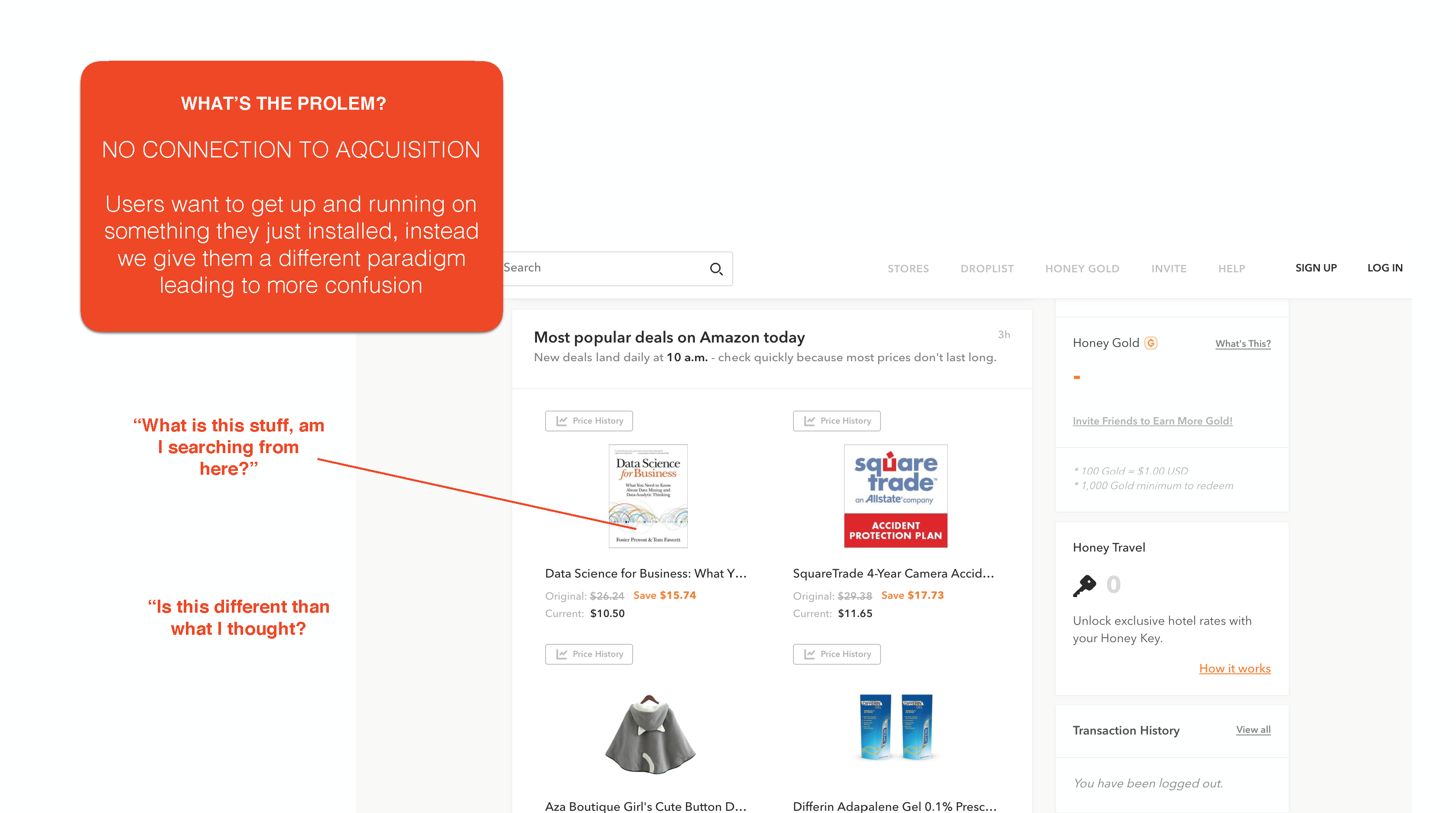
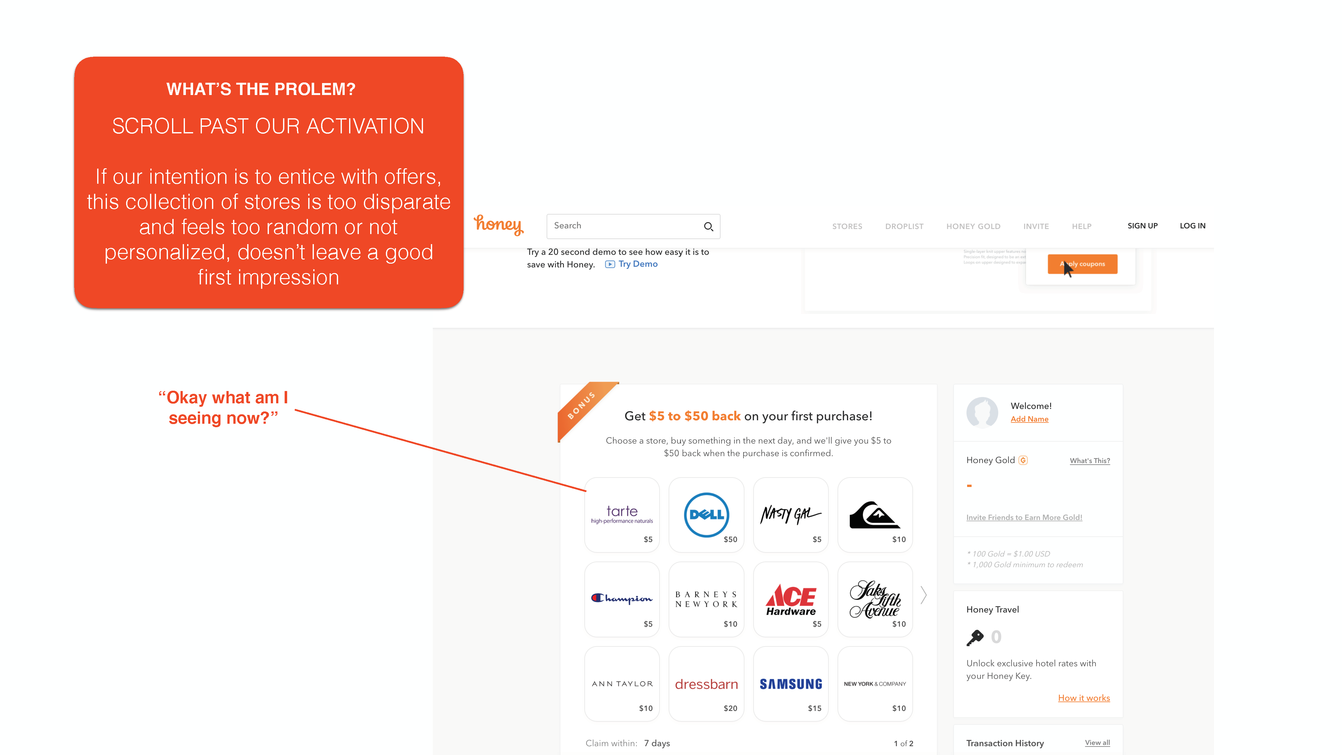
We were not delivering on our acquisition promise. We acquired people on the promise to save money but once installed bombarded them with additional honey features before showing how they could use our core feature.
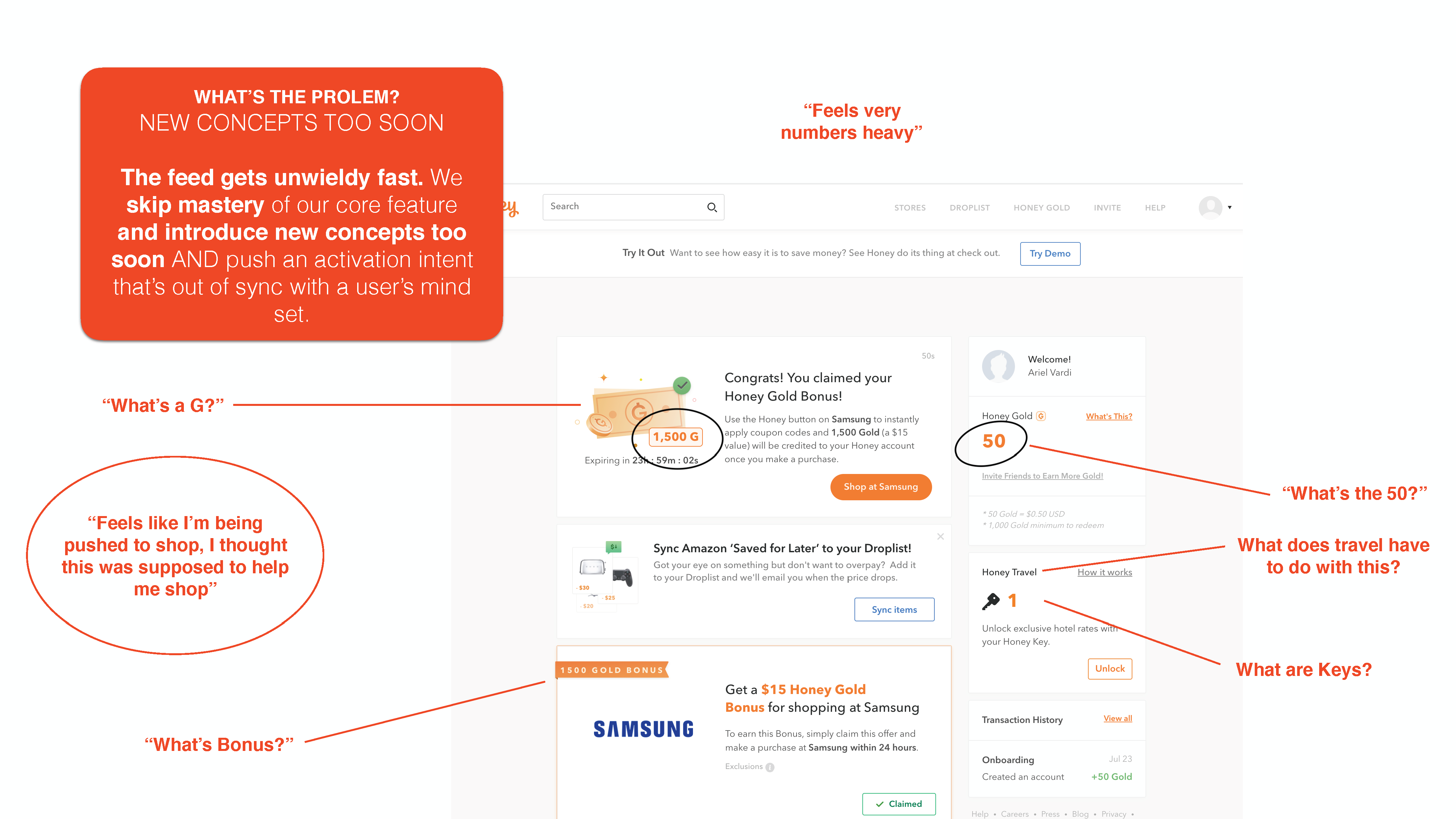
We overwhelmed the user without considering their readiness. The user experience of informing and education Honey features was too overwhelming, introducing too many concepts too quickly before users had mastered how to use the core feature (coupon extension
Insights
Users want to get up and running. After downloading, users to immediately start using and exploring the product and we were not setting them up for success
Using game mechanics to improve onboarding. In order to get up and running, users needed to learn about the product progressively and at the right time, a tactic form game mechanics. It was necessary to define the core experience with the most important benefit a user must understand before anything else, in this case, the coupon extension.
The Solution
A first-time user experience sustaining excitement and interest in using Honey focusing on an interactive introduction to Honey's core value, followed by guided first-time experience exposing additional benefits.
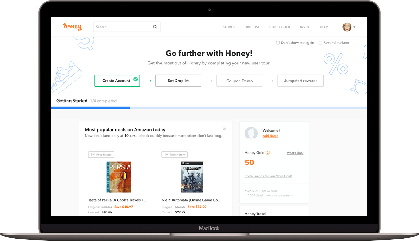

Interactive Onboarding
Once users install Honey, they are brought into an onboarding flow of an interactive demo of the product, setting up their expectations before using for the first time. Depending on the ad that drove them to download, this demo can be contextualized to focus on either the coupon extension or Amazon features.
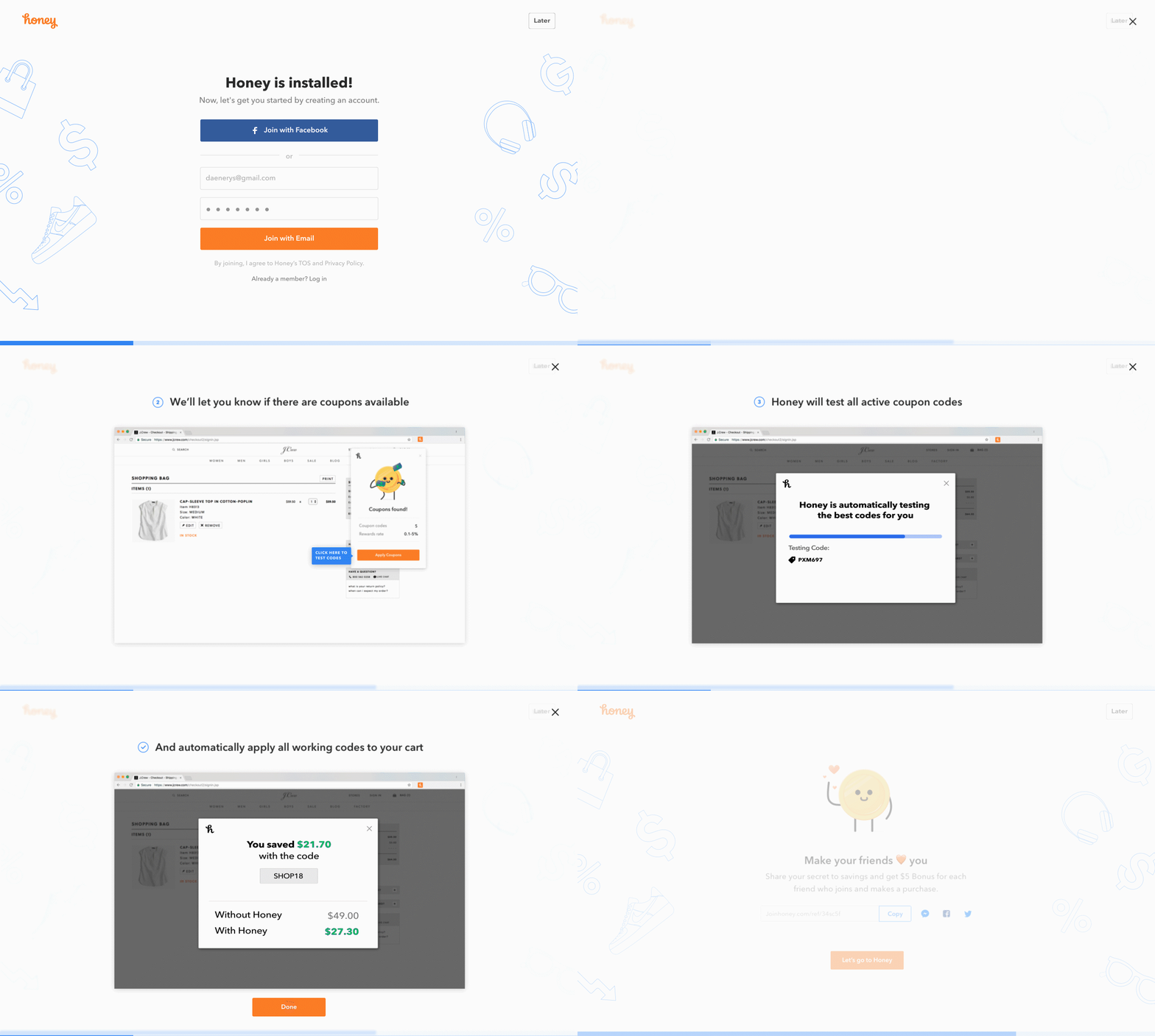

Post-install onborading flow
Clear next steps
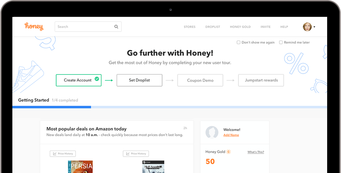
Arriving on the feed, the "Getting Started" module points users to the next step, preventing confusion about where to go or what to do. Each step is designed to introduce a core Honey feature.
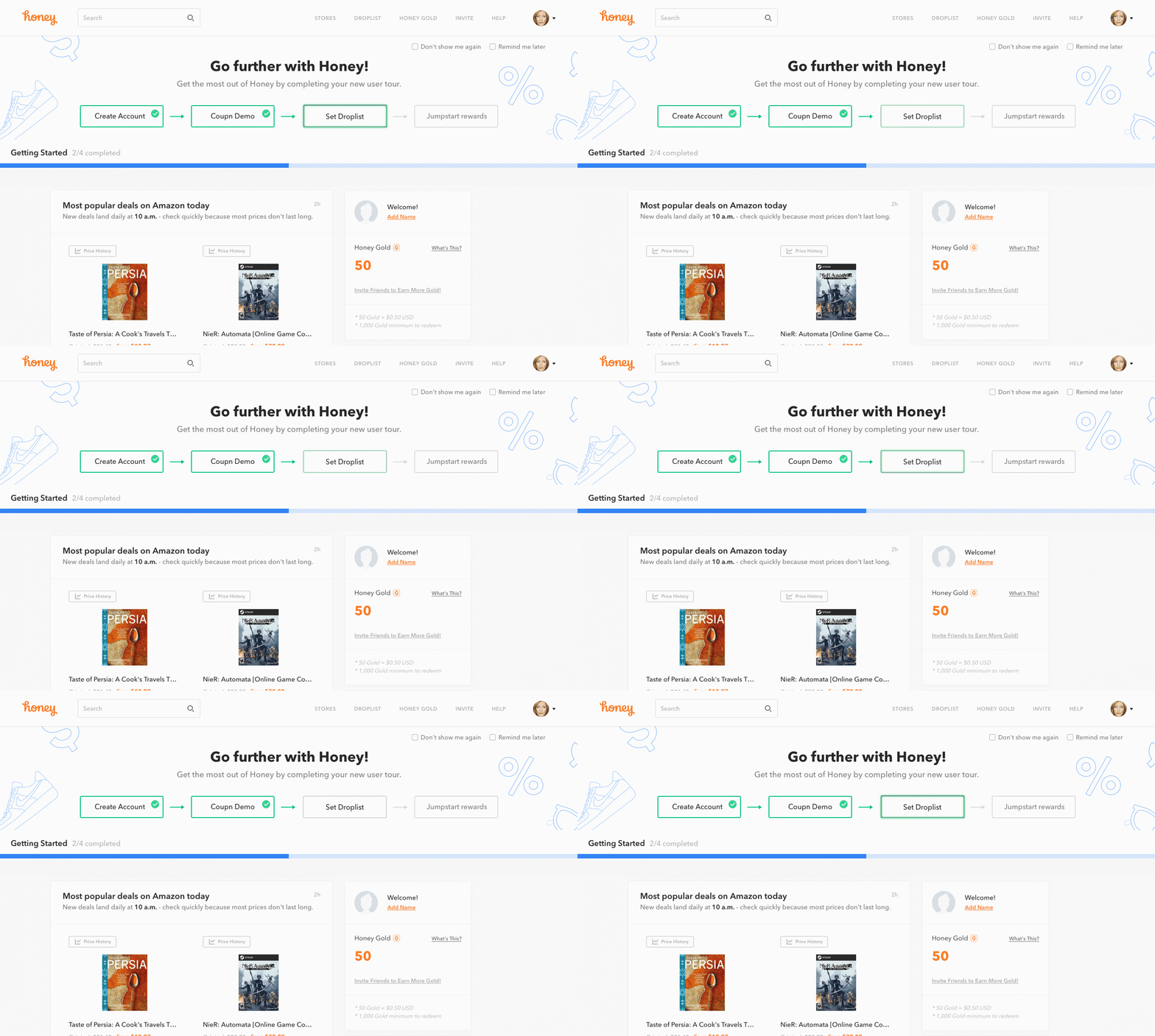

The Getting Started module
Introducing new features at the right time
When a user is already connected to Amazon, the system can pull from "saved for later" items on Amazon and prepopulate them on their Honey Droplist. They can set up their Droplist through a guided explanation instead of encountering an empty state for an unknown feature.
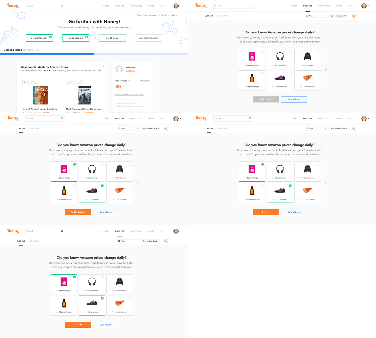

First-time using Droplist

